화면을 누르면 작품 설명과 그라데이션이 사라집니다. 다시 누르면 표시됩니다. 아래로 스크롤하여 작품을 감상하세요.
난중
Nanjung
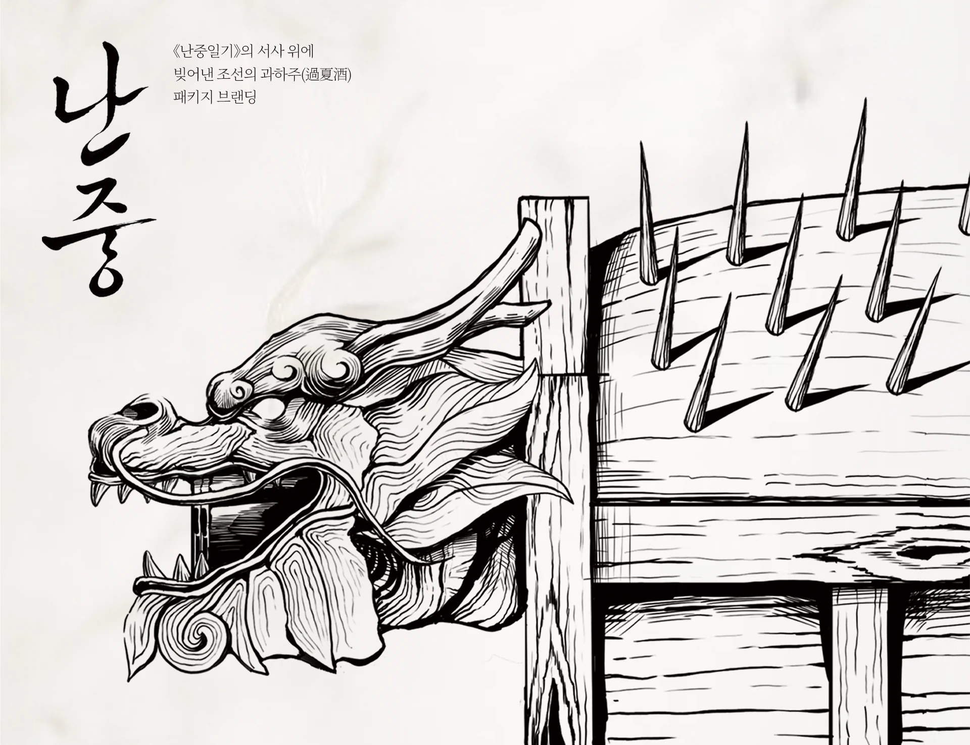
<난중일기>에서 처음 언급된 역사적 서사를 바탕으로 과하주를 재해석한 전통 한국술 브랜드 '난중'입니다. 기존 과하주가 가진 부드럽고 달콤한 이미지에서 벗어나, 이순신 장군의 정신을 시각화하고자 리브랜딩을 진행했습니다. 장군의 '심(애국심)', '지(거북선)', '체(이순신 본인)'를 핵심 콘셉트로 삼아 과하주 패키지를 시리즈로 디자인했습니다. 패키지와 포스터를 전통주의 깊은 가치를 전달해보았습니다.
"Nanjung" is a traditional Korean liquor rebranding project that reinterprets Gwahaju based on its historical narrative first mentioned in Nanjungilgi. Moving beyond the conventional soft and sweet image of Gwahaju, this project visualizes Admiral Yi Sun-sin's heroic spirit. We designed a package series based on the core concepts of "Sim (Patriotism)," "Ji (Turtle Ship)," and "Che (Yi Sun-sin)." Through packaging and typography posters, it delivers a powerful brand narrative and the deep value of traditional liquor.

 jwpoppop

 이정원’S OTHER WORKS ↗